Tracking vegetation trends along the Colorado River: Part 3
Vegetation trends in SkyTruth Alerts make it easy for river restoration advocates to track progress and prioritize projects.
(This is the third in a four-part blog series. Make sure to read the first and second posts here.)
Hello again! Welcome to the third post in our four-part series on tracking vegetation trends along the Colorado River. Last time, we took a detailed look at our satellite image processing workflow for researchers and watershed managers interested in replicating our work. In this post, I’ll walk through how to access and use the project’s outputs in SkyTruth Alerts for those interested in diving in and working with the data on a map.
Colorado vegetation data in SkyTruth Alerts
We’re excited to make our Colorado River vegetation dataset available through SkyTruth Alerts. Most recently, we’ve been focused on mapping vegetation trends along the Verde River in Arizona, so we’ve made a new Verde River map to use as a reference as we walk through how to access and use the new vegetation data in SkyTruth Alerts. (If you’re new to Alerts, we have a how-to-guide and a few video tutorials to help get you started.)
In addition to all of the usual features of SkyTruth Alerts, users can access and view three new data sets in our Verde River map:
- a map of the Verde River and its subwatersheds with annual vegetation data for each subwatershed for 35 years (1985 through 2020);
- a collection of 35 Landsat-derived satellite image composites representing true color images of the complete watershed for each year, and;
- a collection of 35-year vegetation trend images of the watershed in seven spectral indices derived from Landsat, including the Normalized Difference Vegetation Index (NDVI) and others measuring soil moisture, wildfire, and more. (You can learn more about these spectral indices here.)
There’s a lot that users can do with these data sets. Most users will probably want to start with the 35-year trend images. We’ll use the NDVI trend as an example — areas where vegetation greenness has declined appear in shades of orange, while areas where vegetation greenness has increased appear in shades of blue. We’ve also provided a toggle button that allows users to show only “significant” pixels — those outliers with trends that differ from those around them (2.5 standard deviations from the mean). We’re referring to these groups of significant pixels as “hot spots” and “cool spots” of vegetation loss and recovery, respectively.

“Hot spots” (shown in orange) and “cool spots” (shown in blue) of vegetation loss and recovery, respectively, along the Verde River.
After users get a sense of where they might want to investigate vegetation change in a bit more depth, they can use the collection of Landsat-derived annual satellite image composites to look at year-to-year changes. The comparison slider lets users focus in an area of specific interest, load in the first year and spectral index of choice (e.g., NDVI) on the left, load in the second year and spectral index of choice on the right, and “swipe” between the two images to visually compare the changes.
Here’s a guide for accomplishing this:
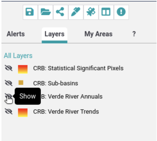
- Click on the “Verde River Annuals” layer.

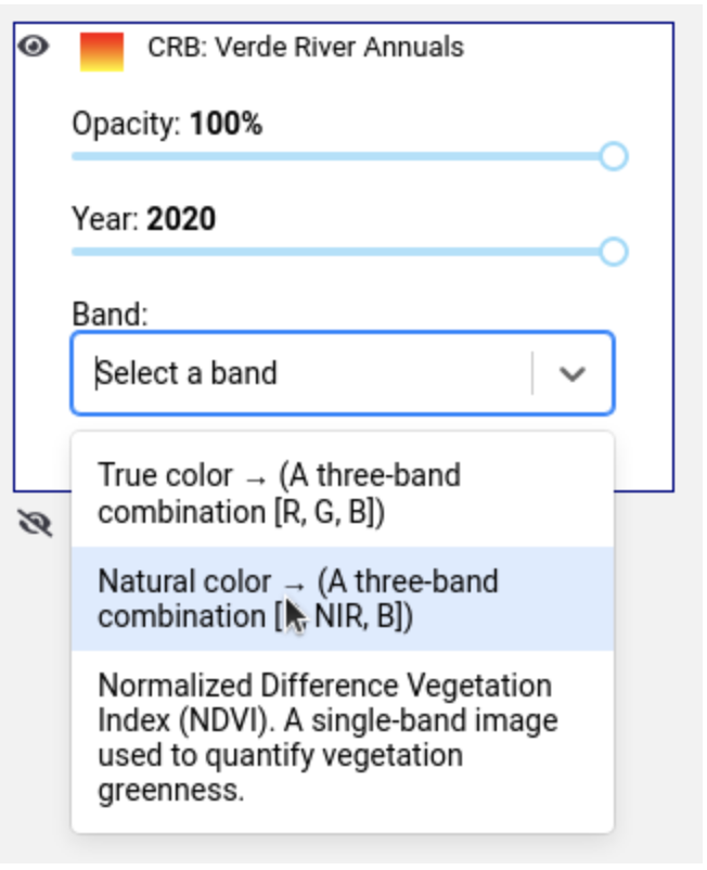
- Select a year and band.

- Click the “Compare layers” icon.

- Set the current map as the first compare map.

- Change the selected year.

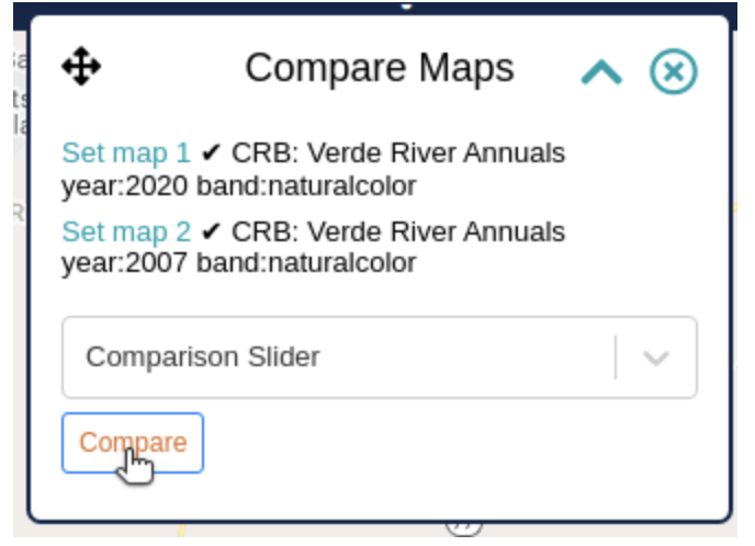
- Set this as the second compare map and click “Compare Maps.”

- Use the slider to juxtapose the two maps.

Lastly, Zoom in and move the map to view the location you’re interested in.
Alerts has several features for users to customize and share maps. Most users will want to start with the “Annotate” feature. This feature allows users to draw on the map and add text and other important notes. And once a user has annotated the map, they can save it and share with colleagues and collaborators.
Get involved
We’re continually working to add new datasets to SkyTruth Alerts, so make sure to sign up for an account even if you don’t call the Verde River watershed home. We’ll be sharing a lot more imagery to analyze in the coming weeks and months. Also, make sure to subscribe to an area of interest (AOI) in Alerts. That way, you’ll get notified as soon as new datasets that may interest you become available. And most importantly: get in there and monitor what’s going on in the places that you care about — make some maps, annotate them, and share them with friends, collaborators, elected officials, journalists, and others.


