Pretty Parallax Planes
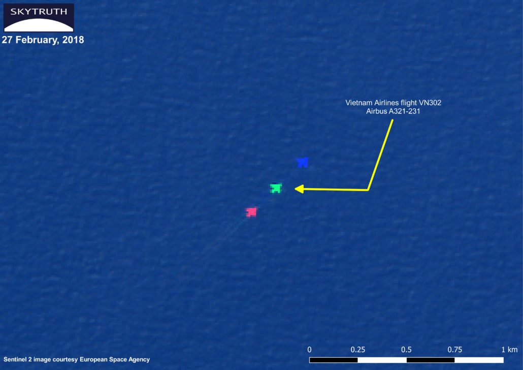
While scanning the European Space Agency’s (ESA) Sentinel-2 satellite images for signs of the Sanchi oil slick, I came across an unusual sight of what appeared to be three, brightly-colored aircraft flying in tight formation. I’m not enough of a GIS rookie to be fooled into thinking China’s latest stealth jets were malfunctioning, what I was observing was a single aircraft’s image split into three spectral bands of red, green, and blue.

This flight was snapped by Sentinel-2 on its way to Tokyo (flight data from Flightradar24.com).
To explain why this happens, we need to take a look at the source of these images: Sentinel-2’s MultiSpectral Instrument (MSI) sensor. This can be thought of as a very advanced camera that can see beyond the usual visual spectrum and into the near-infrared (great for monitoring vegetation) and shortwave infrared. Instead of just one sensor in a camera, the MSI sensor has 12 in a row. For a more technical explanation, take a look at ESA’s guide on the MSI sensor here. Imagine a push-broom with 12, wide bristles and you’ll have an idea of how these sensors sweep across the Earth as the satellite flies overhead. Each sensor splits the image into 10 different spectral bands using a stripe filter which means not only is each band detected at a slightly different angle, they are also detected at slightly different times. What this means for an image like the one above, a “true color” composite made up of the MSI’s red, green, and blue bands, is that when the bands are combined, an assumption has to be made about how far away the object is to correct for the parallax and “focus” the image on the target — and for earth-observation systems like Sentinel, the target is the surface of the earth. An element of parallax is factored in when we combine the bands in the same way that our brains adjust for the parallax of the different angles our eyeballs are seeing. This is called orthorectification. For an example of this, hold your finger halfway between this screen and your face and focus on these words. As well as being a bit blurry, you should be seeing more than one finger. In the same way, the RGB bands are combined with the focus on the surface of the Earth so an aircraft at a higher altitude splits into three images, one for each band. Since this Airbus A321 was cruising at an altitude of about 33,000 feet, the aircraft’s position was projected onto the Earth’s surface resulting in three different images, one for each of the bands.
The time difference between when each band is detected also adds to the offset. This isn’t noticeable for stationary or slow-moving objects but an aircraft is moving fast enough to see a difference. In the image we found, the aircraft’s speed, about 550kts (according to Flightradar24.com), is probably the biggest cause of the shift between images but if you look closely at the contrails, you can see some sideways drift between the first and last image of the plane. The image below, from just off the east coast of Bulgaria, better highlights the two effects of the forward motion of the aircraft and the sideways shift due to parallax.

Example of parallax off the east coast of Bulgaria.
If we really wanted to fix the aircraft’s image, we would need to adjust for the parallax at that distance as well as the delay between each band’s detection (to account for the aircraft’s speed). The result would be that the aircraft would now be one, complete image but everything else would be a multicolor mess.
For more info on this effect, check out this post by Tyler Erickson, or some direct information from the European Space Agency (skip to chapter 2.5).

